INTRODUCTION
We created a range of questions for our poster , magazine and trailer. This is to make sure our film products meet the desires of our target audience. We asked over 20 people about how they would like our finished products to look like , for example the shots and layouts so that our audience enjoy what we make. In order to make an effective film package you have to identify what your target audience want and asking questions is the best way to find out. From the evidence gathered we can find out what our target audience (18+) favour the most and use this to make a successful film package.
MAGAZINE QUESTIONS
1. Should there be ONLY ONE main image on the cover or MULTIPLE images?

a) One Image
|

b) Multiple Images
|
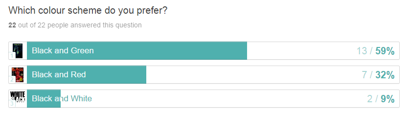
2. What colour scheme do you prefer?

a) Black and Green
|

b) Red and Black
|

c) Black and White
|
3. Which Layout do you prefer?

a)
|

b)
|

c)
|
4. What shot do you prefer?

Long shot
|

Mid Shot
|

Close up
|
5. How many people should be on the front cover?

One person
|

Two people
|
Three people
|
6. Which font do you prefer?

a)
|

b)
|

c)
|

d)
|
7. How much do you think the magazine should cost?
A) £1.00
B) £1.20
C) £1.50
A) £1.00
B) £1.20
C) £1.50
8. Should behind the scenes content be featured in the magazine?
a) Yes
b) No
a) Yes
b) No

|

|
9. How many coverlines should there be?
a) 4
b) 5
c) 6 or more
a) 4
b) 5
c) 6 or more
10. Should the antagonist (killer) or victims be on the front page?

a) Victims
|

b) Antagonist
|
POSTER QUESTIONS
1. What angle should the main image be?

a) Extreme Close Up
|

b) Canted Angle
|

c) High Angle
|
2. What color scheme do you prefer?

a) Black and Red
|

b) Black and Blue
|

c) Black and Brown
|
3. Which poster has your favourite layout?

|

|

|

|
4. Which font do you prefer?

|

|

|
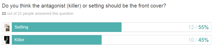
5. Do you think the antagonist (killer) should be on the front cover or the setting (location)?

a) Antagonist (killer)
|

b) Setting
|
6. Where should the film title be?

a) Bottom
|

b) Middle/Top
|
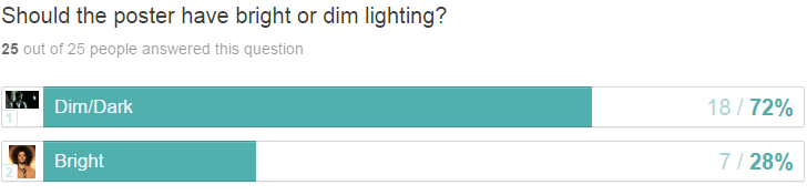
7. Should the poster have bright lighting or dim lighting?

a) Bright
|

b) Dim/Dark
|
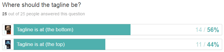
8. Where should the tagline be?

Tagline is at the (top)
|

Tagline is at the (bottom)
|
9. Should there be credits on the poster?
a) yes
b) No
a) yes
b) No
10. If the killer is the main image , what prop (weapon) should they have?

Sword
|

Knife
|

Axe
|
TRAILER QUESTIONS
1. What element interests you the most in a trailer?

a) Narrative
|

b) Sound
|

c) Settings
|

d) lighting
|
2. Do you prefer a fast or slow paced trailer?
|
Slow Paced
|
Fast Paced
|
3. Would you prefer a voice over or dialogue during the trailer? (sound)
|
Voice Over
|
Dialogue
|
4. How many captions do you want to see in the trailer?
a) one
b) Two
c) Three or more
a) one
b) Two
c) Three or more

5. What setting (location) do you find the most interesting/scary?

Woods
|

Basement
|

Graveyard
|

Mental Asylum
|
6. Do you prefer for the more dramatic/graphic scenes to be in the middle or at the end of the trailer?
a) In the Middle
b) At the end
a) In the Middle
b) At the end
7) What lighting do you think is best for a horror trailer?

Bright Lighting
|

Dark Lighting
|

Dim Lighting
|
8) Would you prefer to see the victims more times than the antagonist (killer) to build suspense?
a) Yes
b) No
c) Either
a) Yes
b) No
c) Either
9) How many deaths do you want to see in the trailer?
a) one
b) Two or more
c) none
a) one
b) Two or more
c) none
10) How much dialogue do you think a trailer should have?
|
a) Frequent Dialogue
|
b) Minimum Dialogue
|
EVIDENCE
Video Interviews
|
|
|
Social Media
Three forms of social media were used to ask people the questions we have. Social media is a modern way to connect with people especially our target group (18-30) as were are the "digital age". It is much easier and quicker.

|

|

|
One form of social media app used was whatsapp.

|

|

|

|
Second form of social media used was facebook.

|

|

|

|
Third form of social media used was snapchat.

|

|

|

|
EVALUATION AND RESULTS
We have collected the data from the survey to see the answers our target audience gave to our questions. There were some mixed responses but also a general consensus on some questions. This has now allowed us to make decisions for our products based on these answers.
Magazine Questions

|
1) The Majority of people believe that there should be one main image on the front page , this is a common feature of magazines and from this we know that they prefer to see on main image dominating. |


|
2) Black and green was voted for the most. Black is a common color used to connote horror and green can be used for our magazine as our antagonist is an ex-soldier (camouflage). 3) The layout people most preferred was the paracinema one , the layout of this was very simple and the cover lines did not clutter the page and the image was the main focus. We can use this layout to inspire our final design. 4) Close up was the most preferred shot. I think this is because people prefer the main character to dominate the whole page and to be able to really visualize something up close. 5) Majority of people voted that only one person should be on the front cover , this is normally the case for magazine covers and will most likely be the same for our magazine. 6) As expected the antagonist is voted to be the main image. This will put the antagonist as the main focus and attract the viewers attention more as that is always the most interesting character. 7) Our target audience have made it clear that they do not want too many cover lines as this can make the cover overcrowded. They prefer the cover lines to be kept to a minimum. 8) There was an overwhelming majority of our target audience who believed behind the scenes content should be featured in the magazine. because of this images and information will be included about the production of our trailer. 9) Mixed views were expressed on this question. this suggests that the target audience does not have a certain preference for the price of the magazine. 10) THE "SCREAM" font was the most liked and this could be because it is a popular font used for horror related media. In our magazine we will use a similar font for our heading and coverlines. |
Poster Questions

|
1) Our target audience preferred a canted angle for our main image for the poster. This is an interesting angle that is not commonly used like a close up or long shot. When taking shots for our poster we can incorporate using this angle more often. |

|
2) The most favorable color scheme chosen was blue and black. From this we can tell that perhaps red and black is not a strong enough color scheme to attract our viewers and blue and black gives a more "mysterious and eerie" effect. |
|
3) For this question , unlike the magazine people think that the setting should be the main image. To contrast with our magazine , this would be a good idea for us to do and I believe using a location makes viewers want to know more about the film.
|

|
4) I think the reason why there is a split between the two answers is because the film title looks well placed whether it is at the bottom or at the top. It can be either way as long as it is large and bold. |


|
5) Slasher is our sub genre. So our target audience collectively preferring a knife works well. a knife is a common weapon antagonists have which is probably why most people prefer it. 6) Most of our audience prefer for the tagline of the film to be at the bottom of the poster. This is commonly where taglines are placed on film posters when researching various posters. 7) As expected the target audience believe that credits should be included on the poster. on the poster the crdits will be at the bottom and this is a common convention used for posters. 8) Dark lighting was the preferred type for our poster as expected. we aim to make our poster very dark to connote mystery and fear of our antagonist. 9) Both a location or antagonist could be used for our poster as the results show that both are preferred. we may use our antagonist instead of an location as that is the main focus of our film. 10) The majority of our audience preferred the impact inspired font "living hell". a font like this will most likely be used on our poster or magazine , so that we are following our feedback. |
Trailer Questions

|
1) Setting and sound (SFX , soundtrack , score) seem to be the most eye catching elements for people when watching a trailer. This gives us an indication that we have to make sure the sound and setting is an important aspect and that it controls the mood of the trailer. |

|
2) Our target audience believe dim lighting is the best lighting we should use for our trailers. The darker the lighting the more suspense and eeriness which is the effect we want to create for our trailer. |

|
3) Out of all the different locations , a mental asylum is the most interesting and or mysterious for our viewers. I think a mental asylum is appropriate for our trailer as part of our synopsis is a man who suffers from PTSD from past service in the army. |

|
4) In some trailers there are many captions , however our target audience want the minimum captions. I think this is because there is not always a need for captions and people prefer to see parts of the film rather than a lot of captions. |


|
5) From this , we can see that people do not necessarily think there should be one dominant pace but do prefer a fast paced trailer than a slow paced one. A balance is what they want and this is good as the more graphic and dramatic scenes can be shown at a fast pace and the beginning (equilibrium) can start off very slow. 6) From the response we have gathered that our audience prefer not to witness any deaths during the trailer and if any only one. this helps to sustain the mystery of the film. 7) The majority of the audience want to see deaths during the trailer and not at the end of the trailer , this may be because it ruins the anticipation of the film.
8) In our trailer there will not be any deaths shown. including a death scence can remove the anticipation of the trailer and can make it seem "predictable". 9) We can see from this that our audience prefer for there to be frequent dialogue rather than a voice over throughout the trailer. this may suggest they do not like the "narrative" type of approach for horror movies. |
Conclusion
Overall , the audience research task has helped for us to gather more ideas for our final products and what will work best to reach our target audience and fulfill their needs. The majority of questions had one answer that was voted the most , which makes it even easier to understand what our target audience prefers and how we act upon this feedback will determine the quality of our final products.
The feedback on our trailer shows us that our audience pay attention to the setting of trailers and are particularly interested at what type of locations are present. this means we have to choose a good and suitable location for our trailer as this is one element they find very important. they also prefer dim lighting in comparison to dark lighting , this is understandable and it is most likely that we will only be using dim lighting in our trailer. there will be a mixture of pace during the trailer , some scenes will be editied to be faster or slower than others. as expected there will not be any death scenes in the trailer , this could ruin the "shock" of the trailer and it reveals too much away. trailers are only supposed to be a snippet of what the movie is about.
The feedback on our trailer shows us that our audience pay attention to the setting of trailers and are particularly interested at what type of locations are present. this means we have to choose a good and suitable location for our trailer as this is one element they find very important. they also prefer dim lighting in comparison to dark lighting , this is understandable and it is most likely that we will only be using dim lighting in our trailer. there will be a mixture of pace during the trailer , some scenes will be editied to be faster or slower than others. as expected there will not be any death scenes in the trailer , this could ruin the "shock" of the trailer and it reveals too much away. trailers are only supposed to be a snippet of what the movie is about.
