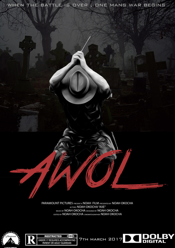
This page will include all our print design stages which we have developed, in order for us to come up with the best out of print design, we looked at existing horror magazines and film posters , which have heavily inspired how our work is. this page will include our real media text stage, our 12 drawn drafts for the magazine and poster , our 8 digital drafts for the magazine and poster, test shots, and our more detailed digital drafts.
REAL MEDIA TEXT
film Poster

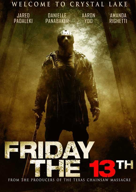
what we like about this film poster is the main image and all the aspects of it , the image is extremely detailed from the etched detail on the chainsaw to the details on the mask on the antagonists face. another aspect of the front cover is the use of the simple typograhy and the positioning of the film title which is near the bottom of the poster , this allows the audience to focus on the main image rather than being distracted by the font. dg
|

the effectiveness of a simple film poster really shows on this scream 4 poster , the use of the main image being a white mask is really effective on the black background as it makes it stick , also the the effect on the mask , making the bottom of the mask look like a knife, we are big fans of the simple bold typography and the use of the black , red and white colour scheme.
|
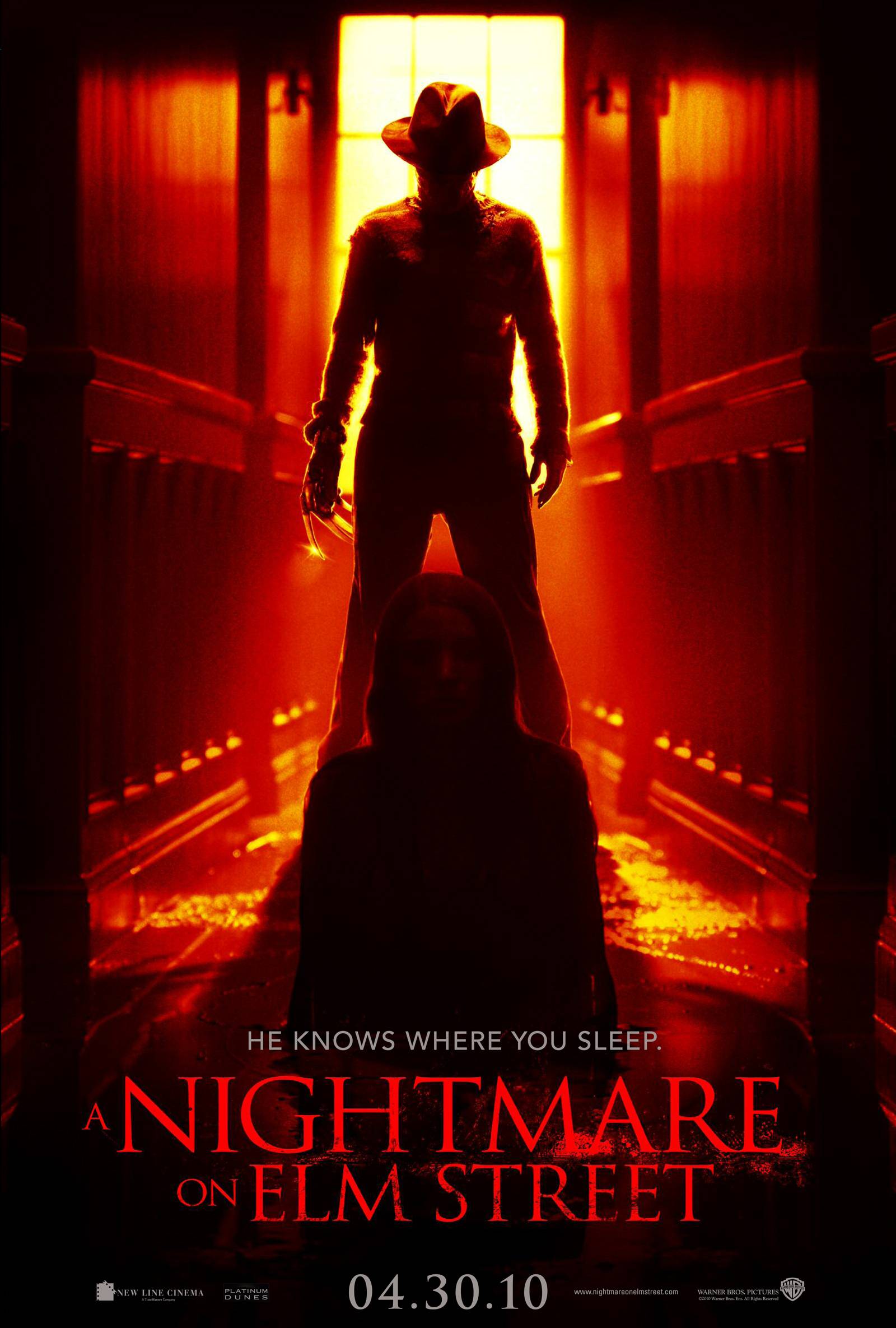
this is one of our favorite horror film posters , every part of it is well designed. We are big fans of the eroding effect on the font because it makes the font look really good, the background in the main image creates a spooky backdrop and makes the antagonist stick out, also the use of the iconic weapon which the antagonist is wielding makes the antagonist become more threatening .
|
this horror film is part of the few posters that use 2 people on the front , which are the antagonist and protagonist. we really like the use of the warming effect on the picture , this connotes a heated situation. the use of bright red typography used for the film title connotes blood. the black and red colour scheme is great because the black creates the use of darkness and the red represents blood.
|

this poster is so simplistic that it is left up to the veiwers imagination as there is no character wielding the weapon. another aspect of the poster is that they used a weapon as the main image , the weapon has blood on it , this is a great effect as it automatically shows the viewers it is a horror film
|
MAGAZINE

the layout of this this magazine is really good , as it is structured which makes easy reading .
|

the use of an animated image works really well because it is very colourful and bright , making it stand out on the store shelves.
|

i like this magazine because it only uses one main image on the front cover , this means that readers won't get distracted by any other images.
|

this poster is great as it uses many effects e..g. blood , its has more than three different fonts which shows creativity and loads of promotional gifts.
|

we like the typography used for the masthead , we like it because of the colour and the bleeding effect.
|
DRAWN DRAFTS
Poster

draft 1.
i chose to draw this layout as it included our antagonist and the weapon as the main focus so people can have an idea what the film is about. draft 2. i really liked this poster as it brings an element of spook and mystery to the film as it is just showing the antagonist's eyes. |

draft 3.
i really like this film poster as i managed to include the background setting , main prop and the antagonist draft 4. what i really liked about this poster was the main image as it has the antagonist in a mid action shot grasping the main prop |

draft 5.
this film poster was inspired by the film slasher and included the main prop highlighted draft 6. this film poster was unique as it was the only poster which just included the prop by it self without the antagonist |
Magazine

draft 1.
i like this horror magazine cover from the way the the the main cover line is at an angle which add more diversity to the magazine draft 2. i like this draft as it has a very organized look to it which would make it easier for readers to navigate |

draft 3.
this is a very unique draft as it includes three main images with the main cover line directly under it draft 4. this draft incudes a snazzy verticle look which is very eye catching for readers and anybody walking buy in shops |

draft 5.
this poster draft was quite unique as it is the only one of the drafts i created which include two people in the main image draft 6. i really liked this draft as it included the film reel which was a design which i have seen included in many other magazines |
digital draft
Magazines(basic)
draft 1.
this is the digital version of drawn draft 6 
draft 4.
this draft includes three people in the main image |

draft 2.
in this draft i took a more basic aproach to the magazine so it had more emphasis on the main image 
draft 5.
this is digital version of drawn draft 2 |

draft 3.
this sis a digital version of drawn draft 1 
draft 6.
this digital draft includes two people in the main image |
Posters(basic)

draft 1.
this draft is a digital version of drawn draft 6 
draft 4.
this is a digital version of draft 5 |

draft 2.
this draft is the digital version of drawn draft 4 
draft 5.
this is a digital version of draft 3 |

draft 3.
was supposed to be draft one , however i changed it so the antagonist was wielding two weapons 
draft 6.
is the only digital draft with two people |
posters(advanced)

what i like about this draft is that the antagonist face is concealed and the red effect in the trees connote blood and death.
|

i really like this one because the weapon is the main focus of the poster even though the antagonist is on the poster
|
the mid action shot of the antagonist using the weapon is really good and that every thing except from the title is in black and white
|
magazine(advance)

|

|

|
these drafts were created so i could get an idea of what the magazine front cover may look like , for these draft i used a template.
drawn+digital hybrid

|

|
as we did not have any shots of our antagonist at the time , these drafts were created so i caould get a rough idea of what the poster would look like in the end
test shots


best shots

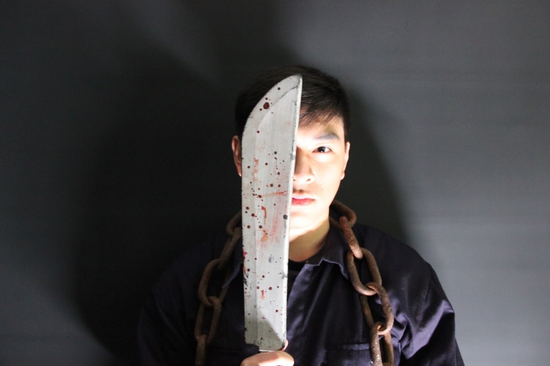
this picture is good because its a really sharp image and you can see all the detail on the props
|

this picture is good because the subject is looking directly at the camera holding the weapon.
|

i liked this picture because the shadow behind the subject creates a really cool effect on the picture
|
worst shots
the shot was not very good as the lighting was to bright
|

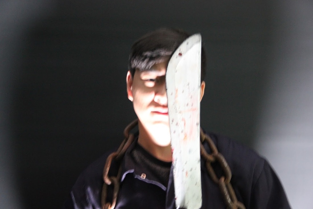
this shot was not very good as the image is out of focus.
|

this picture was not very good because you can see under the mask
|
typography

i really like were the title is position in this digital draft
|

i like the use of 2 colours one the font for the film title
|

i really like the richness of the red used in the film title
|
