how effective is the combination of your main product and ancillary texts?
on this page we will be discussing how effectively our media products ( magazine, poster, trailer , work) our main products show continuity between one another. we chose to present our film trough different products to demonstrate the combination of our main products and media text. we will be looking at aspects of our product such as the identity and synergy of the products.
examples

|

|
these mood boards include products from saw and the walking dead , as you can see both brands show cross media convergence and synergythrough keeping the same fonts throughout the production of their products same colour scheme and brand identity which makes the products recognisable to the majority of people
examples of synergy and ideas of media convergence
synergy is used frequently by large companies mainly used by media conglomerates as the different elements work together to promote linked products across different media , synergy has a larger effect than if a product (film) was just released alone , conglomerates like sony are able to use synergy to boost profits from their product e.g. when spider man was released in 2002 , sony where also able to release games , soundtrack , costume and merchandise upon its release.
bellow are some examples:
ill manors film released at the same time as plan B's soundtrack
the film Skyfall promotes the soundtrack which promotes the DVD , which promotes the game and as all products are owned within the Sony company , all the profit stays within the company , which is vertical intergration.
cross media convergence includes the combining of two or more mediums to promote a product , these different mediums are - TV , film , computer graphics , radio , website , social media etc... . Media convergence in the film industry can happen during the production , distribution and exhibition stages.

evolution of cross media convergence since the early 90's
|

|
successful film marketing campaigns

final destination is a great example of a franchise which used cross media convergence and synergy to its advantage. The first final destination movie was released in the early 2000s and since the success the first film had created , 4 more movies had been released since then .Between the years of 2000 and 2011 the Final Destination franchise accumulated a grand total of $665,080,636 at the box office, and it one of the most popular horror movie franchises to date.
posters

|

|

|

|

|
the first three final destination film posters kept certain conventions from the first movie poster , such as having a group of characters in each of the posters and all the film posters apart from the first film have the use of the same ancillary text which makes the poster instantly recognisable , so fans who enjoyed the first film would see the poster of one of the other films \in the franchise and want to watch it because they enjoyed the first one.
all these posters have great use of synergy as they all use similar colour schemes ( blacks, dark blue, grey and white) this also helps boost the recognisability factor of the posters.
the last two instalments of the film both include shattered skulls on the poster , without the inclusion of any characters
trailers
|
|
|
|
|
|
all the final destination trailers include humourless dialogue and a lot of voice overs are used during the trailer to directs the audience attention and keeps the focused on the trailer. the dialogue in this trailer is simple and used words such as " kill , death and time to die " to help build up the suspense of the trailer.
all the trailers have the same linear structure , whereby a super natural disaster occurs and a group of young adults are killed of one by one by a series of these natural disasters . However in the final destination 5 trailer it states the rules have changed this adds a new aspect and dynamic to what they usually include in the trailers , this also makes viewers more interested.
all the final destination trailers follow the same conventions of pace, they all start of slowly but as as dramatic events take place and unfold the level of tension is high so therefore the pace of the the trailer increases dramatically.
billboard

the billboard and the film posters both contain continuity as they both contain the same main image and the same colour scheme , this shows that large companies such as the ones who produced final destination can afford to have great synergy between their products
comics

|

|

|

|

|
is a five-issue comic book miniseries published by Zenescope Entertainment in 2006. Written by Mike Kalvoda, with art by both Lan Medina and Rodel Noora, the series was re-released in trade paperback format in 2007, and the first issue was reissued in 2009, The font used on the comics is not exactly the same as the fonts used on the film magazines , however they are similar and this shows continuation.
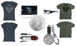
Merchandise and Products
|

|
These pieces of merchandise shows synergy and cross media convergence well , all of these pieces have the skull ( from the final destination five movie , this makes it recognisable to buyers and people walking by.

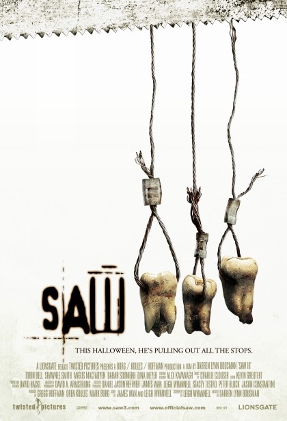
Posters

|

|
|

|

|

|

|
All of the Saw film posters have the same typography and colour scheme , this shows continuation from the first poster to the last poster , although the typography are all in similar but different colours , it is still highly recognisable due to the the shape of the text. All of the posters main Image contain some sort of damaged , bloodied or decapitated body part e.g. removed teeth and decapitated head. These dark themes allow the saw franchise to be recognisable from what they put on their poster, also the pictures give an insight to what the films themes are are on.
Trailer
|
|
|
|
|
|
|
|
|
Billboard

This billboard shares the exact layout and fonts as the posters , this makes it recognisable to those who have seen the posters
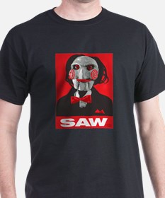
Merchandise and Products

|

|
|
Saws merchandise and products show great cross media convergence and synergy as they all include the logo somewhere on the product and all share the same colour scheme , most of the saw products contain an infamous character from the film called jigsaw.
Ride

|

|
The saw ride shows synergy and continuation from other saw products by displaying a huge billboard beside the ride which has the saw logo and ancillary text which makes it recognisable
Website

Saws official website shows great level on continuity by using all the same typography and ancillary text , which shows that this is an official website. Although the colour scheme is not the same as the colour schemes on the film posters the website is still recognisable.
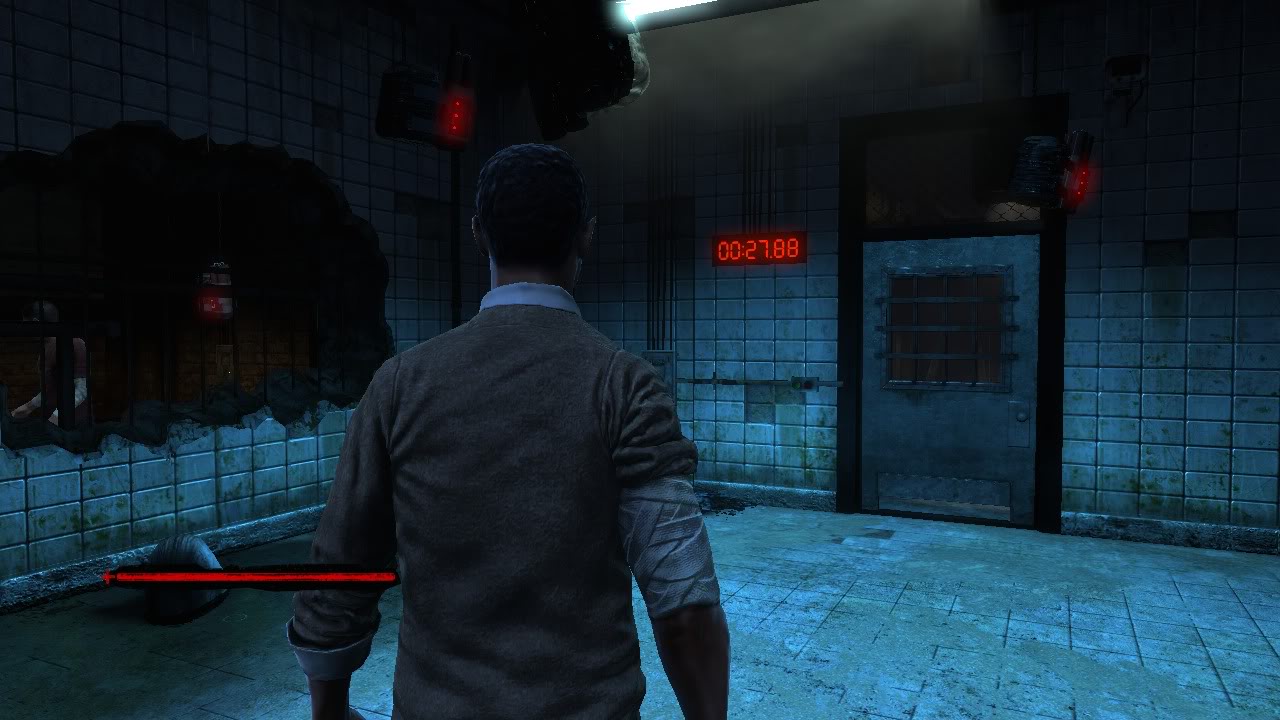
Videogame

|
|
the saw video game front cover uses the exact same typography as all the other saw products which makes it recognisable to all saw fans. the colour scheme is similar , if not the same as the films and the main image is off jigsaw , who is the most recognisable character from the the saw franchise
Title Typography
|

|

|

|
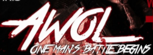
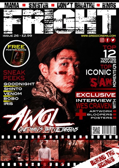
From a quick glance , you can instantly see the continuity within the title typography I have used for my film poster , film magazine , trailer and website. all though the colours , size and stroke may differ for each one , it is the exact same font used for each title and each one has an italic effect on the font which makes it recognisable to all. each title typography is different for each product it is on.
the magazine Awol typography is white so that it sticks out of the the dark colours and background on the magazine
the Awol typography used on the poster and trailer both have a red drop shadow this was to create the theme of blood , which is an ongoing theme in our film as it is a slasher.
the magazine Awol typography is white so that it sticks out of the the dark colours and background on the magazine
the Awol typography used on the poster and trailer both have a red drop shadow this was to create the theme of blood , which is an ongoing theme in our film as it is a slasher.
Colour Scheme

we used the colour blood red as it represents blood, and as our media product is a slasher film it contains lots of bloody scenes
|

the dark grey is used to represent all the darkness in our film as it connotes dullness , death and evilness and these themes go hand in hand with our product
|

Although the white is not used a lot in our products , it was used quite a bit. especially for some of the fonts and for some of the out lines around our images.
|
Continuity/Synergy

|
|


|
our film poster , magazine , trailer and website all show continuity in some way or another due to the layout of the media products , the colour scheme or dull themes and the typography. through this I managed to promote cross media convergence and synergy through the products I produced
Logo

|
|
we made sure we used the exact same logo that we used in the trailer and website to show continuation and synergy on each of my media products.
Antagonist

|

|
the characters used in my film poster and magazine cover are not the same picture , but is of the same person. these pictures show these characters wearing the same outfit , which is the army clothes and wielding the same weapon. this shows continuation and synergy between the different media products.
Advertisment

|

|
this is how we promote the film poster by putting it on bus stops and displaying it in the underground. we displayed the same picture on both the underground and the bus stops. this show us using continuation through out our advertisement.
VideoGame and Controller

|

|
the Xbox one game cover shoes a variant of the normal film poster. the Xbox cover does not include the dessert type gradient down the right of the poster. this version puts more emphasis on the character and the weapon.
the Xbox control has the same colour scheme used on all of our media products ,this shows synergy and cross media convergence
the Xbox control has the same colour scheme used on all of our media products ,this shows synergy and cross media convergence
Clothing Products

|

|

|
All of our pieces of clothig follow the colour scheme of our other media products. all of our pieces of clothing include the typography.
Home Veiwing Platforms

|

|
the Awol posters are easily identified as they have a very recognisable font and main image , this means it can be used on home viewing programmes and people will know what it is
Conclusion
to summarize i feel that the media products that I have produced display good levels of synergy and cross media , i manage to achieve this through consistent use of colour scheme , typography and ancillary text.
